top of page


Website Revamp

Goals & objectives
Revamp a local business website gearing more towards users within the 20-30 age group. The client had specific feature requests for the website.
Challenges
Limitations of the web hosting service
The customer requested the website to remain on Weebly.com. As of early 2022, Weebly doesn't offer a lot of options to personalize one's website, e.g. it cannot connect directly to Google Business Profile and text size cannot be changed to specific px scale. This lead to using outside sources to find an alternative solutions, e.g. using Canva to create personalized buttons.
Computer vs phone view
Updating the phone screen version of the website with a user-friendly UI was the top priority for this project. Weebly doesn't allow making changes onto a mobile version without making the same changes for the web version (e.g. font size, location on the screen). The computer screen version had to be modified for the benefit of a better user experience on a mobile version, per client's request.
Process
I began the project with user interviews and competitive analysis. Then I created a persona, which allowed me to design structures and lo-fi paper wireframes for the website. The information and wireframes were presented to the client before proceeding. Once approved by the client, I implemented notes from the interviews and meetings with the client into the design. I performed usability testing of the hi-fi prototype with two groups: web-based users and mobile version users. Results were presented to the client and final modifications were made.
- Before & After -
The earlier design was optimized for PC/laptop screen users. Client requested a total revamp of the website to fit current trends in UX/UI design and to catch attention of a new demographic (home owners in their late 20s/early 30s).

Before

After
Negative space has been a common trend in UX/UI prior to 2022, however, it was predicted that a stronger emphasis on negative space will continue to be prominent in this year's designs (Sources: Masterclass.com, Hotjar.com)
Within "Services", client requested a auto-played slideshow to play a wide range of pictures from their past work. In order to maintain the minimalistic interface and create more negative space, I arranged the slideshow and text vertically, rather than keeping in horizontally.

Before

After
With spacing, I had to keep in mind how the images and text would appear on the mobile screen since I couldn't modify it separately.


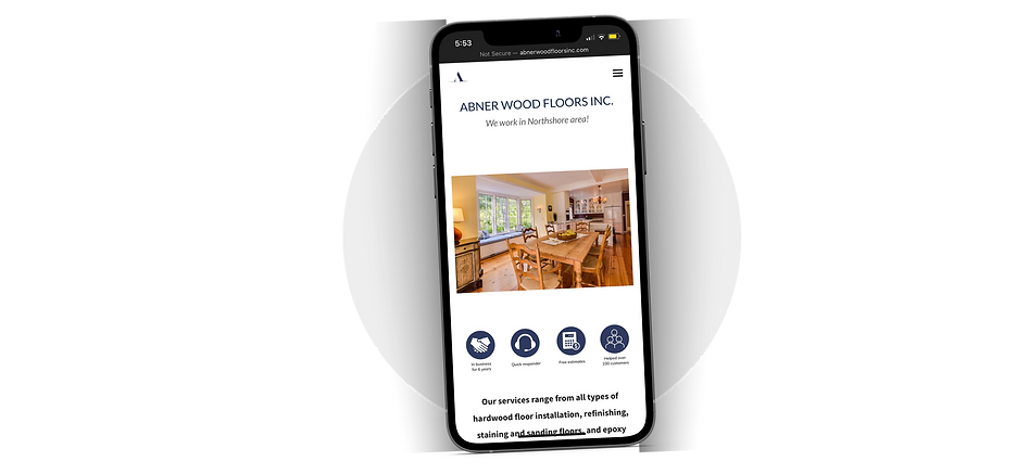
Screenshots from the website as seen from iPhone 13
Access the website
Click icon below to see the full website revamp
I'm currently looking for new opportunities: gebski.olivia@gmail.com
bottom of page